Why colour management matters
In print and signage, colour is not just a creative detail, it is a cost factor. A job that looks right on screen but prints too dark, too dull, or too far from the approved brand colour can lead to reprints, delays, and unhappy clients. The good news is that colour consistency is usually improved by a small set of practical tools, not by buying everything on the market.
Colour management is the process of controlling how colour is captured, displayed, converted, and reproduced across devices. In a print workflow, that usually means matching what the designer sees, what the RIP interprets, and what the press or printer can actually reproduce on a specific substrate.
Start with the essentials, not the extras
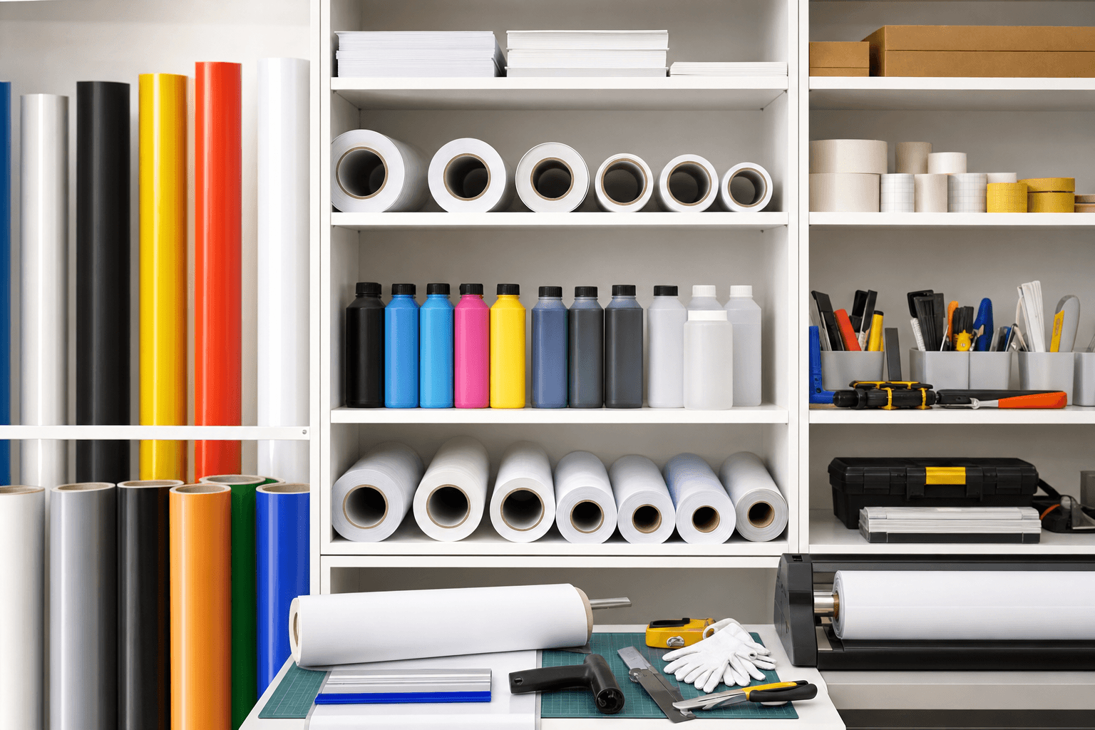
If you are building a colour management setup from scratch, the most useful tools are often the simplest ones:
- A calibrated monitor
- A profiling device, such as a spectrophotometer or colorimeter
- ICC profiles for each printer and media combination
- A controlled viewing light, especially for proofing and client sign-off
These tools solve different problems. A monitor calibration device helps the screen show colour more accurately. ICC profiles tell the software and RIP how a printer behaves on a particular material. A spectrophotometer measures printed colour with far more reliability than the eye alone. Controlled lighting reduces disputes caused by viewing prints under different light sources.
Industry practice and colour science both show that human judgement alone is inconsistent, especially when the print is viewed under changing light, on different papers, or after multiple adjustments. For repeatable output, measurement beats guesswork.
Calibrated monitors are the first line of defence
A monitor that is too bright is one of the most common causes of print mismatch. Many screens ship at brightness levels that make images look punchy for general use, but this can lead operators to overcompensate during editing. A calibration tool helps set the display to a known standard, usually adjusting white point, gamma, and luminance.
When choosing a calibration device, look for:
- Support for regular recalibration
- Compatibility with your operating system and design software
- Reasonable measurement speed for busy teams
- The ability to create and store custom display profiles
For most print workflows, a colorimeter is enough for monitor calibration. A spectrophotometer is more versatile overall, but it is usually more valuable later in the process, because it can also measure printed output.
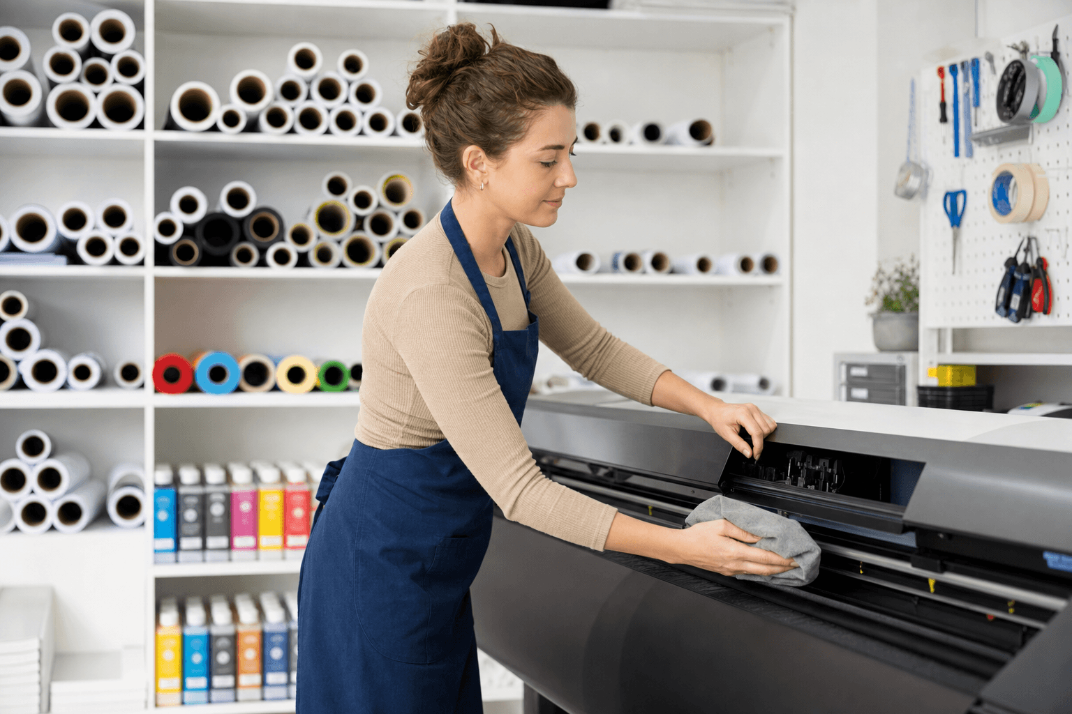
Spectrophotometers are the workhorse for print accuracy
If you need one colour management tool that delivers the most value across print and signage, it is usually a spectrophotometer. Unlike a simple visual check, it measures reflected colour accurately and can be used to build printer profiles, verify colour targets, and compare output against standards.
A spectrophotometer is especially useful if you produce work across multiple media, such as coated paper, uncoated stock, adhesive vinyl, or rigid substrates. Each surface changes how ink or toner behaves, so the same file can produce different results unless the printer is profiled correctly.
When comparing models, consider:
- Aperture size, which affects how small an area can be measured
- Compatibility with your RIP or profiling software
- Ease of use for staff who are not colour specialists
- Whether it supports spot colour measurement and quality control checks
- Portability, if you need to verify colour in different production areas
For many small and mid-sized print businesses, a mid-range handheld spectrophotometer is the best balance of capability and cost. It can support onboarding new media, checking brand colours, and validating whether a printer is performing within tolerance.
ICC profiles do the heavy lifting in production
Profiles are often overlooked because they are not physical tools, but they are central to a reliable workflow. An ICC profile describes how a device reproduces colour. In practical terms, it helps the RIP translate incoming artwork into output your printer can reproduce more predictably on a specific material.
The key point is that one printer does not have one profile. It needs a profile for each meaningful combination of printer, ink set, media, and sometimes resolution or print mode. A profile built for glossy photo paper will not accurately represent the same printer on matte synthetic media.
A good profiling workflow usually includes:
- Printing a target chart under stable conditions
- Measuring the printed patches with a spectrophotometer
- Generating a profile in profiling software
- Testing the profile with a separate verification target
- Saving the setup clearly so it can be reused
The quality of the profile depends on the consistency of the printing environment. If inks are low, nozzles are missing, humidity is unstable, or the media feed is inconsistent, the profile will reflect those problems. In other words, profiling cannot replace maintenance, but it can reveal where the process is weak.
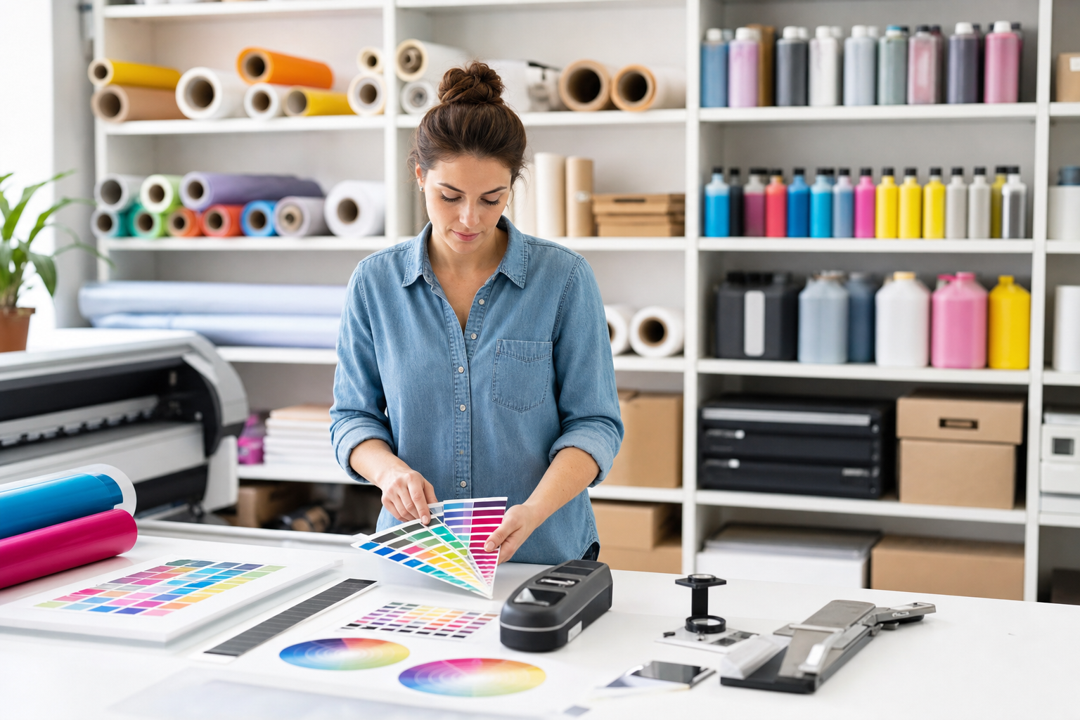
Controlled lighting prevents expensive misunderstandings
A colour-managed job can still be rejected if it is viewed in poor light. This happens often with spot colours, white-heavy designs, and subtle brand hues. A sample checked under warm office lighting may appear different from the same print viewed in daylight or under a retail display.
For proofing and sign-off, aim for a standardised viewing environment. A light booth is ideal, but even a consistent D50 or D65 viewing lamp can reduce disputes. The important thing is to compare samples under the same conditions every time.
If your business often deals with strict brand clients, lighting control can save time in approvals. It gives sales staff and production teams a shared reference point, which makes conversations about colour more objective.
How to choose what to buy first
If budget is limited, do not try to buy every colour tool at once. Match the purchase to your main pain point:
- If artwork looks right on screen but prints wrong, start with monitor calibration
- If different printers or media produce inconsistent results, buy a spectrophotometer and profiling software
- If client sign-off is causing disputes, add standard viewing lights or a light booth
- If you handle brand-critical work, prioritise verification tools that check output against targets
For many businesses, the best sequence is monitor calibration first, spectrophotometer second, then controlled viewing and verification tools. That order addresses the most common errors from design to output.
Practical buying checklist
Before buying, ask these questions:
- Does the tool fit the printers and software we already use?
- Can non-specialist staff use it without slowing production?
- Will it help us reduce reprints or approve work faster?
- Can it support more than one substrate or print process?
- Does it include software updates and measurable standards, not just marketing claims?
It also helps to choose tools that have a clear training path. A powerful device is only useful if your team knows when to use it and how to interpret the results.
The bottom line
Colour management works best when it is practical, measured, and repeatable. For most print and signage businesses, the highest-value tools are a calibrated monitor, a spectrophotometer, reliable ICC profiles, and controlled lighting for proofs. Together, they reduce guesswork, improve consistency, and protect margins.
If you are starting small, focus on the parts of the workflow where errors are most expensive. That usually means screen calibration first, then print measurement, then verification and viewing. The result is a more predictable process, fewer reprints, and better confidence when a client asks, is this the right colour?
Quality supplies, backed by real expertise. Explore the wider Chemtech Group health ecosystem.